

Project Description
The first project at Ironhack was to digitize a leading regional supermarket focused on offering high-quality products and a personalized shopping experience.
We had to design a user experience that gone above and beyond the e-commerce marketplace models that Amazon and other competitors (like Walmart) are offering in addition to add value for their customers by finding a way to leverage their successful premium store model and replicate it into a differentiating digital experience.
Work Areas
User Research
User Analysis
Mapping
Wireframing / Prototyping
Information Architecture
Visual Design
Interaction Design
What is ABC?
ABC is a personalizet groceries app that offers food bundels where people can buy fast.
When you launch the app the first step is to answer a survey which helps you to choose your shopping preferences.
Fast
Personalized
Research
The first step we took for user research was making the LEAN Survey Canvas to learn what information we need, from whom, what information I already have to obtain the first draft of the questions for surveys and interviews.
For the survey we implemented 10 questions using Typeform and for the interviews we asked people if they could help me out by responding some questions that allowed me to empathise more with them.

Affinity Diagram
We had one week to get information from surveys and interviews.
Next step was to use Affinity Diagram to order data and discover trends.
First, we divided the surveys and interviews data into qualitative and quantitative, followed by related groups and categorized headers.
Finally, we grouped users thoughts around the core objective so we can ideate on them later.

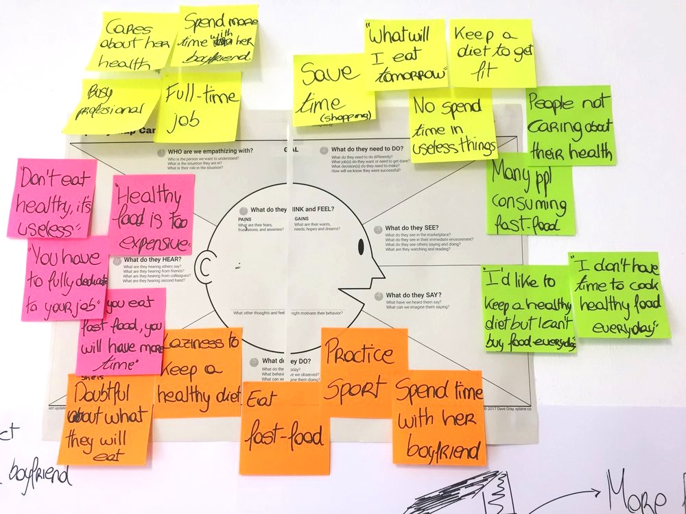
Empathy Map
Mind Map

Lean UX Canvas
We had one week to get information from surveys and interviews. Next step was to use Lean UX Canvas to order data and discover what were we building, why were we building it, and who were we building it for and identify if we had weak areas.

Problem Statement

User Persona

User Journey
After implementing storyboards and user stories for specific case scenarios, I stablished a user journey graphic represented by people’s desires and approaches to their main pain points. However, nothing was defined until testing low/mid fidelity prototypes to get detailed insights.

User Flow

After we ideated using all different Design Thinking methods (Affinity Diagram, Journey Map, Empathy Map, Mindmap...) until we reached our different feature that would differentiate us from the rest of the competitors: "THE TINDER METHOD".
A card swiping system but used for groceries to save time and build special bundles for each person.
Then we started working on the feature prioritization, sitemap and all the user flows to finally start sketching and wireframing.
Visual Design
Once we have all the wireframes we had to get inspired in order to create our moodboard to start creating the UI of the project.
As our user persona was a young girl (millennial) we decided to make a flat design interface with own designed icons. We also wanted the app to be entertaining, as the card swiping part is focused to be funny and quick.
All the screens are made Sketch and all the animations are made in Flinto and Principle.

S U R V E Y
B U N D L E S


Related Links


